It feels like for the last few weeks all people have done is either hero worship CD Projekt Red’s failed magnum opus (if I see another comment from someone who claims to have played it on PS4 and only have a few glitches I’m legally allowed to commit homicide, we get it), or lambast it from pillar to post. So is there much room left in the conversation for yet another article to emerge digging the boots into this walking Icarus metaphor? Yes, yes there is. I’ve spent roughly 30 hours with Cyberpunk 2077, and I feel that attempting to figure out how I feel about it is a lot like listening to the new album of a band you’ve always loved. You’re trying desperately to love it despite a sinking feeling that it at the very least kind of sucks a bit (looking at you Mr Bungle). As Kieron Vebrugge’s excellent review states, the game makes you work to find its good bits, rather than actually presenting itself in a compelling and organic way. Placing this sort of agency on the player is a lot of pressure, and in my opinion, unwise. But whether or not you enjoy diving into every email and datashard to piece together what the world itself can’t actually tell you simply by existing, let’s all agree that Cyberpunk’s UI is one of the greatest crimes the game commits, managing to drag down everything down with it.
Perhaps the fact the game runs like a three-legged dog on base Xbox and PS4 consoles should be evidence enough that consoles were a bit of an afterthought for CDPR, but I’m not sure if any of them playtested the game’s menus with controller in hand. You want a simple blade system navigated with the shoulder buttons, with sub-menus handled with the triggers like every other RPG? Too bad. Here’s a cursor you have to move with the thumbsticks, peasant. If any developer out there is listening, please never make your menus navigable primarily with a cursor, a thumbstick is not a mouse. But we adapt, we master the cursor, yet the bad times continue. In the start menu, you are presented with five submenus, and hovering over any one of those with the revolutionary cursor system will reveal several other sub-submenus. Most of these are merely ‘shortcuts’, for instance you can quickly (to use that term lightly) navigate to the cyberware (cybernetic augments and such) or backpack (a hodgepodge of absolutely all the ridiculous things you pick up) by hovering over the Inventory tab. If you don’t want to use these shortcuts, you can simply open the full Inventory tab, then navigate to these areas within it. It’s clunky, and it sucks big time. Inventory management is one of the core pillars of an RPG, and if you’re wasting the player’s time with an unintuitive clusterfuck like this, you either actively hate the players trying to navigate your menus, or fundamentally misunderstand the limitations of their peripherals.
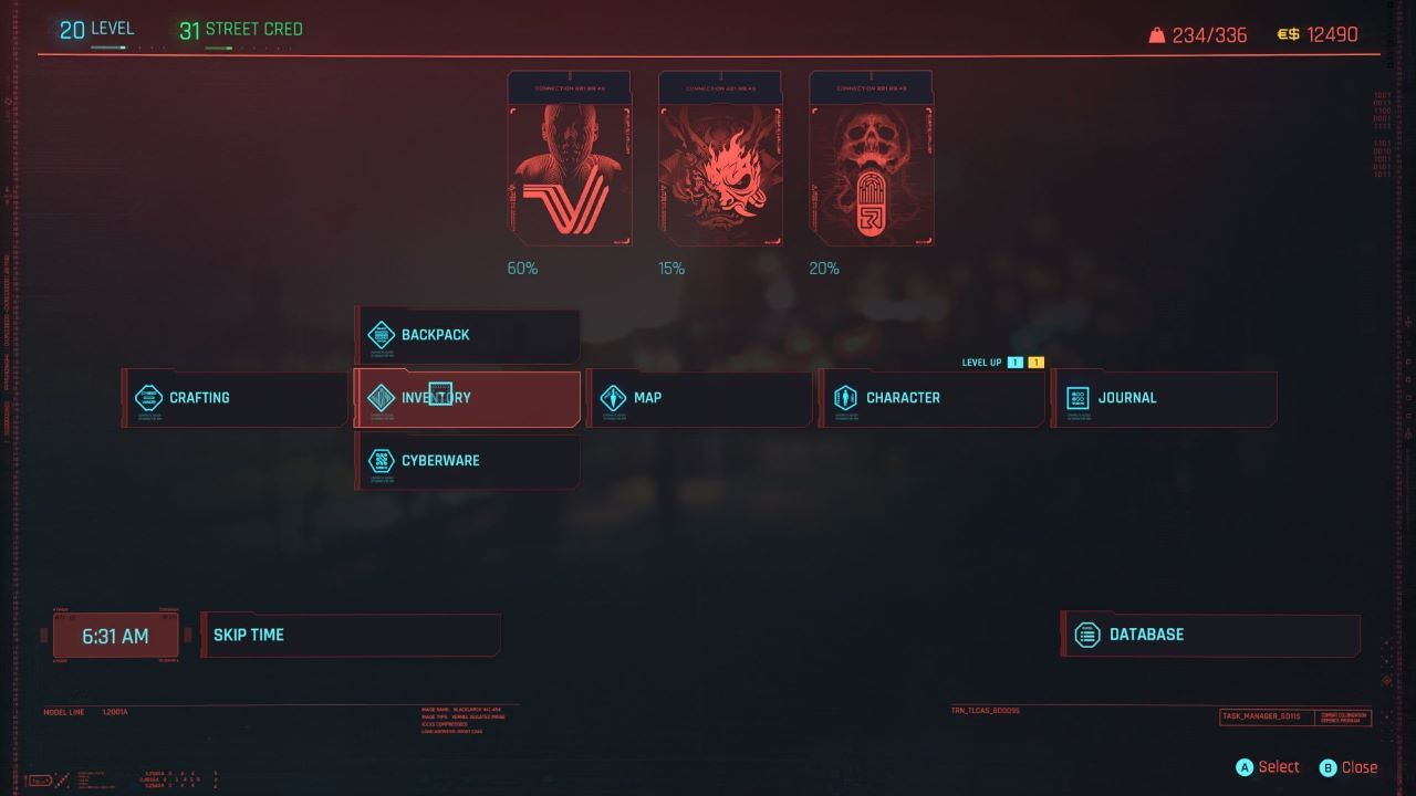
This is where the magic happens
It is simply an exercise in frustration to sift through which combination of terrible fedora, basketball shorts and boots will improve my stats and simultaneously make me look like I was dressed by some retro-futuristic haute couture fashion designer getting back to their neo-post-punk-pre-avant garde-minmaximilism roots. Sifting through weapons is similarly ridiculous, where they’re all just smooshed in so inelegantly into a wall of tiles where I can barely tell what I’ve got equipped, let alone which gun is better than which. The ability to sort weapons and armour by their stats is quite well hidden, requiring you to hover over a button labelled ‘Default’ (no mention of it actually pertaining to sorting in the label) and changing the option in a dropdown menu. This helps immensely in deciding whether to sell that hideous bandana or continuing to wear it unironically, but keep in mind it’ll reset to the mysterious ‘Default’ sorting every time you reopen your inventory. Additionally, the game is absolutely screaming out for a ‘Mark As Junk’ button for unwanted weapons, armour and consumables. The sore lack of such a simple feature makes selling your stash pile of utterly worthless shit you pick up at an alarming rate even more of a painful exercise.
When the menus aren’t being capricious in how you access information, in a fun twist the UI actually actively hides things that are important to quests. I’ll give two solid examples of when I had to consult the Internet with shame in my heart because I could not for the life of me figure out where to find two bits of information. The rock of shame was soon replaced by the stone of anger though, when I realised just how ridiculous the solution to my quandaries were. In the first instance, I’d just taken down a cyberpsycho (people who have gone mad and become violent as a result of installing too many incompatible augments or who have spent too long navigating Cyberpunk’s menus on console), and was told I had to ‘send the information to Regina.’ Surely I just have to give her a call to tell her I’d done the deed? So I hold the down direction on the D-Pad and call her – she picks up but it’s all idle chitchat – is this a bugged quest? Surely not in a game of this calibre and pedigree. Turns out I have to navigate to the ‘Messages’ section, by first opening up the phone then pressing a random button. I then have to find her in the kilometre-long list of people I get messages from (in none of which Roland wants to go bowling), and locate the thread about the cyberpsychos. I then have to hover the cursor (oh cursor, how I hate thee so) over a prefabricated reply and click on it to send it. Why this bloody circus act? The fact she so easily got my number and seems to accurately know my comings and goings anyway would suggest she probably already knows I’ve taken him down. Why this song and dance?
In the second instance, I had to read a specific datashard to progress a quest (another cyberpsycho quest in fact – go figure). Now before you call me out, I’ve read a datashard or two in my time, usually when I pick it up (it’s where a lot of the game’s actual depth is found, after all) by a quick press of the D-pad. But in this instance I had a particular datashard I’d picked up in a looting frenzy, that had escaped my notice and so had been banished to my inventory. So now all I had to do was find it. Stupidly, I first looked in the cursed Inventory section with its lack of blades and logical presentation. There was no specific section for quest items, so I then turned to my Journal section. I opened it as I had many times, and was only greeted by an ever-growing preponderance of quests in sprawling list format. The trick of course lay in the cursor hovering; you aren’t supposed to click on the Journal section, but simply hover over it to reveal its juicy sub-submenus, including one specifically designated for datashards. To add insult to injury, there are hundreds of those dastardly datashards strewn across Night City, and if you think it was easy finding the one I wanted in this ludicrous list of all the ones I’d picked up so far then you obviously haven’t been listening to this rant now, have you?
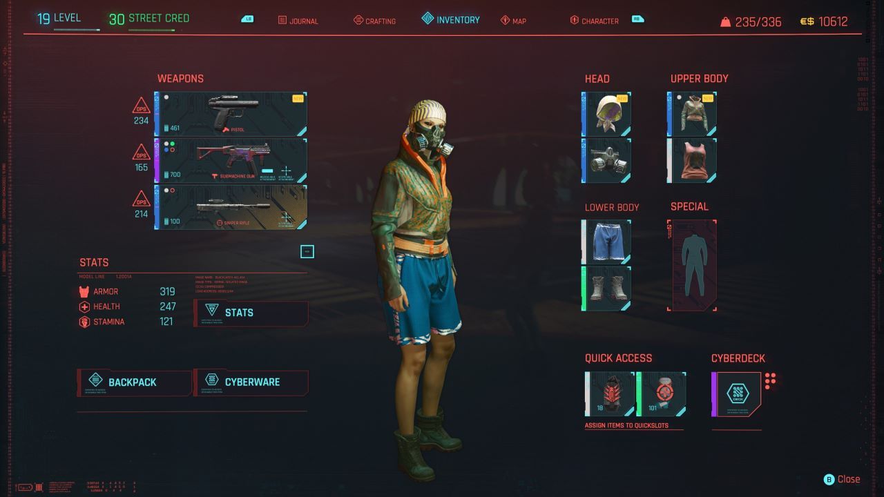
Why are you like this?
I’ve never really played a game where I can’t truly decide if I like it, but at the end of the day, I wanted to love Cyberpunk (it’s that new CD from an old favourite band metaphor coming back); passion counts for a lot in my book, and it’s clear CDPR have that stuff on tap. But when you truly love something it usually becomes easy to look past its flaws, and sometimes it even becomes an annoying part of the game’s charm and meme potential (get off the dang roof, Roach!). But this UI is just so abysmal on console I wonder if all CDPR’s playtesters were timid yes men who were perhaps too blinded by bugs to realise what an utter chore the menu navigation is. Some will claim it to be a minor aspect of game design to be complaining about, and PC players with actual mice and rigs so powerful that they can turn RTX on in not only games but real life too will probably also be gaffawing into their neckbeards, but every moment I spend in Cyberpunk’s menus makes me feel like CDPR forgot the humble console peasant to whom they promised so much.
Kieran is a consummate troll and outspoken detractor of the Uncharted series. He once fought a bear in the Alaskan wilderness while on a spirit quest and has a PhD in organic synthetic chemistry XBL: Shadow0fTheDog PSN: H8_Kill_Destroy


